Fun With Responsive Email Banners
Backstory
We’re working on a series of Orientation emails for people who are new to Code School. Since they are all focused on sharing information about features, we want to make them distinctive. Drew and Justin had a hilarious “over the shoulder via Hipchat” art direction session to come up with this. Needless to say, I love it.

Heavy Breathing
This morning, I opened it up with fresh eyes in order to start building a layout. Peeking a little closer, I was thinking that those different color stripes look nice and the ribbon looks awesome coming over the edge like that.
The coffee kicked in and I was all like “WAIT A MINUTE, THIS HAS TO GO INTO A RESPONSIVE TABLE. THIS ISN’T NAM, THERE ARE RULES!”. “How will I do this? Is this the thing that will finally prove to the world that I can’t front-end?” “Does Drew hate me? What did I do to him? Was it the joke about the folder organization?”
A pack of Welch’s fruit snacks calmed me down and I dove into solving this.
The Problems
Most importantly, we don’t want a harsh cut off. We want those stripes at the top to run to the edges of the client and to look like it’s a layered stack of elements. Scaling is the enemy here, as the height of those will change.
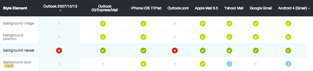
In modern browsers, this is easily achieved with a background image and background-size. You could be extra cool and even do a CSS gradient. Email clients laugh in the face of web standards, though. Background images aren’t even fully supported.
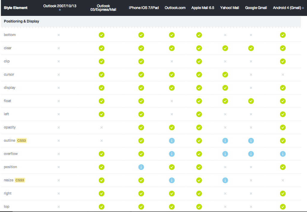
The next problem is the ribbon overlapping two of the stripes. Negative margins, fixed positions, etc. are like Bigfoot to email client builders. Some people swear they exist and even have footage of them in the wild. Then there are the skeptics.
CSS like it’s ‘99
I first learned markup by slicing up PSDs and doing table tricks to make layouts. Luckily, my memory hasn’t gone yet. I know that not everyone had the luxury of doing crazy hacks like this, so I thought I’d share it for you whippersnappers.
Rows to the Rescue
This “header” is now going to be three rows, with two nested tables.
The first row is going to be a solid background color. We’ll use a media query to change the height of it at smaller resolutions.
The second row is going to have a solid background color. It will have a nested table for an image with just the top of the ribbon. The nested table will be a max width of 600px. The sliced image top will be as wide as the main image, so that it will scale the same and control the height of the row.

The third row will have a solid background color. It will have a nested table with the rest of the image. Like the previous one, it will have a max width of 600px and height will be determined by image scaling.

Boom
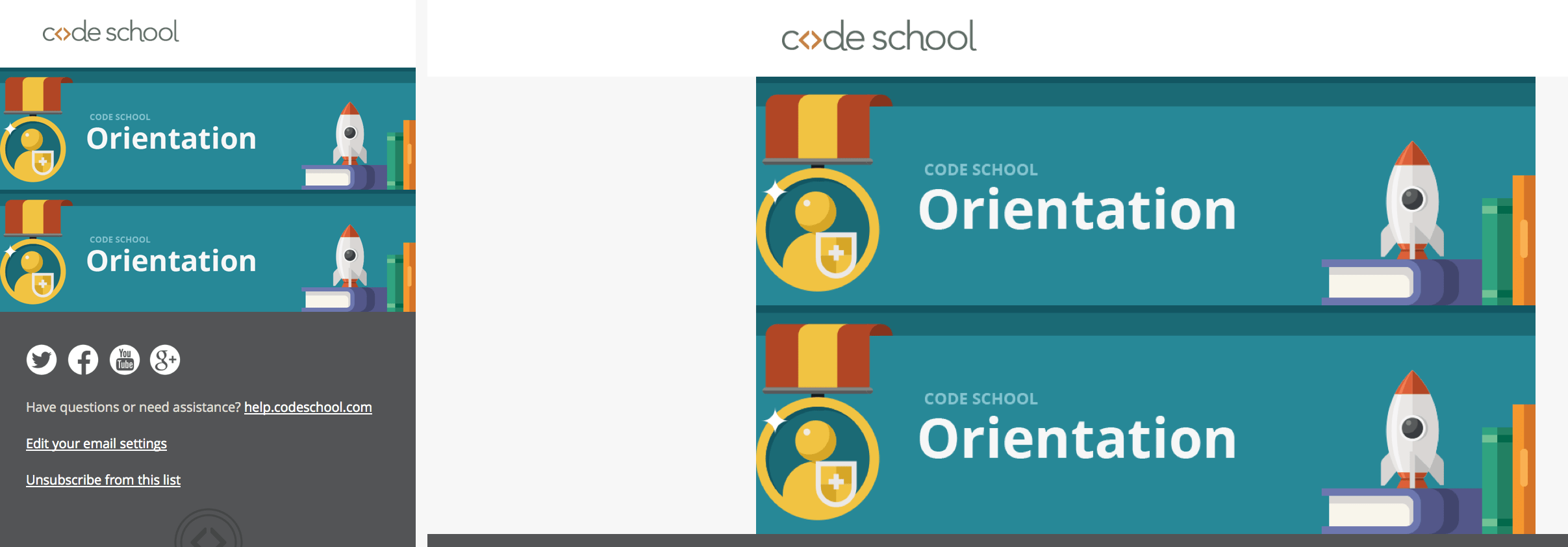
Here’s a screenshot of the responsive table version and the original image.