A Short Review of My First Webflow Project
I’m a front-end dev software engineer, and while I have been intrigued by the state of no-code apps, I hadn’t had a real reason to try using one. A reason appeared as I wanted to make a landing page to see if people would be interested in attending another Front-end Conf in St. Pete. I had created a very basic page, but my partner-in-confs accurately said it was boring.
Fun and Fast
I wanted something fun, and I wanted it fast, with one necessity: I had to keep it on the domain. I have played around with Framer a lot lately, but you can’t export from it, so that was out. The conf site has historical info on it from previous years (even though technically, I’m not linking to them from the splash page right now). I hadn’t played with Webflow yet, but I did see that you can export code if you have a paid plan.
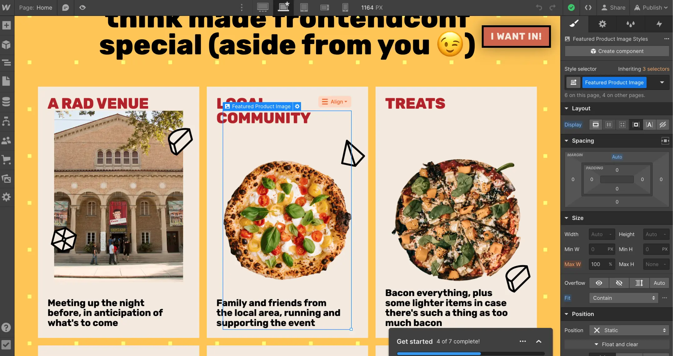
I’m not a designer, so a search for webflow templates led me to Pizza Guy. I could “see” it working in my head, replacing all that delicious-looking pizza with pics from past events. The $24 was a no-brainer; I could spend entire days building and not come up with something that rad. Importing took like 5 seconds, and I was ready to start customizing.
Well, Shit
Because I work in code, I instantly wanted to see the template in a real browser tab instead of in the Webflow builder. When I did, all my hopes and dreams went pissing away. My personal Mac is a 2015, 15” MBP, so the resolution is 1440x900. As I scrolled, all kinds of things were janky. I was bummed and thought maybe all this no-code stuff wasn’t legit. (Spoiler: I was wrong)
I spent the next few hours making a much lower-quality version of the first two sections in code before having to call it a night. The next day, I tested again on my work Mac, and everything was fine. So, I asked a buddy who has a machine somewhere in the middle to try it. It was fine for him, and we talked through testing some things. The end result of our testing is that the problem is only above 1400px, in the latest Chrome, on Monterey.
Game On!
I was so excited that I could hardly wait to get done with work and back in Webflow. I can’t give a thorough critique of Webflow in general from this experience since I started with a template instead of building something with it. In this case, I’d really be critiquing this one person’s implementation of things. For the most part, everything was pretty simple to update. I spent under an hour customizing all the pieces that were easy to figure out before wanting to get it out into code to continue.
The one area that I got stuck on was a section I ended up not using anyways. The problem isn’t necessarily anything Webflow-specific. The challenge was that the cards were built to use images with transparency in order to keep them centered in the cards and maintain equal heights. I would’ve needed to use real photos, and I couldn’t figure out how to rework them in the 30ish minutes I was willing to try. I knew I could do it in code easily, so I planned to refactor that part.

In the end, I skipped it. I felt like I was adding it more to follow the template than to add valuable information to someone reading the page.
Exporting Is Familiar and Awesome
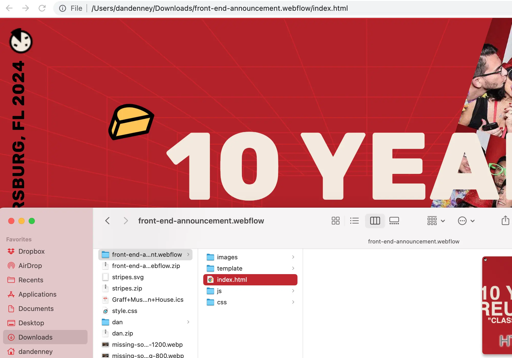
I use 11ty often because there’s enough abstraction to improve my efficiency, but I’m always very close to having real source code that can be viewed in a browser. Webflow is very similar. The UI and workflow is different, but when you export, you get a folder with all of the pure assets that just works.

Everything is unoptimized, but I think that’s a good choice by them. It would be brutal if someone just FTP’d these up to a server, but I wanted to be able to work with the direct files and let 11ty handle the necessary bits for building.
I think all-in-all, I spent about 1.5 hours in Webflow and 2-3 hours getting everything into code and making final rounds of changes. So, for about $55 and 4 hours of my time, I ended up with a super fun landing page.
The Perf is Better On Webflow’s Servers
The initial build in Webflow gets a 74 for mobile for performance, with the usual suspects: image sizes, JavaScript, webfont loads, etc. I removed a whole section with six images, and the live version typically scores 71. I didn’t dedicate much time to fixing it since the page is temporary and is only to gauge interest for a conference. I do think that it would be pretty straightforward to improve things if this was for a real project that would remain on the web.
I Believe In the Potential of No Code Solutions
I’m going to continue working with Webflow, trying to build something from scratch. I absolutely love that these tools enable designers to see their work directly in the browser and learn how to work across screen sizes. I also love that they let a front-end person like myself make some fantastic experiences more quickly than we could in code.
Between these tools and all of the fantastic things shipping in CSS, I’m so excited to be building things on the web!