re:build Conference 2012
I was recently lucky enough to tag along with Jason VanLue up to Indianapolis to attend re:build 2012. Big, big thank you to Jason for working it out, Envy Labs for sending me and to the re:build team for their hospitality.
Indy
Prior to heading up, I really didn’t know much about Indianapolis or the web community in the area. The city is absolutely charming and the people are warm and friendly. The architecture is gorgeous, there is a bustling downtown and they have a penchant for craft beer (which is near and dear to my heart and belly).

Before leaving, Jason and I roamed around downtown for a bit and I took this pic from a monument. I knew I’d be writing up my thoughts on the conf and that the words etched into stone here seem to be amongst the Indy core values and are definitely a part of re:build.
Overall Thoughts
The event is coordinated by Justin Harter and Tony Dewan. They absolutely know how to make everyone feel special. Their attention to detail, clear communication and calm demeanors set the tone for the whole event. I was extra lucky in that I was an attendee but I also got to see how they took care of the speakers. They are fantastic hosts on both sides so I highly recommend attending and accepting speaking invitations from them.
The Pre-Party
I attend (and Twitter stalk) many conferences. A popular ‘problem’ is that people arrive to the area the night before the event and want to meet up with people. You’ll often see pockets of tweets with hashtags looking for other attendees. Understanding this, the re:build team put together a pre-party at this awesome place called The Speakeasy. It is a local hub with a startup focus that has a wonderful industrial design. Conversations were helped along by some local microbrew, thanks to ExactTarget sponsoring the evening (and the speaker dinner). From what I saw, people took it pretty easy so they were still ready for some inspiration and learning the next day.
Registration
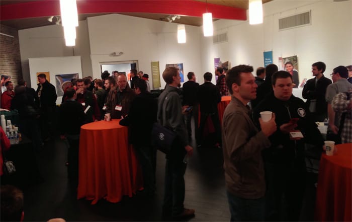
Getting a couple hundred people checked in can be tricky but having registration available at the pre-party helped reduce the crowd in the morning. They also had a big room filled with coffee, snacks and tall tables for people to eat and converse around. Thank you very much to Harvest for sponsoring the goodies.
The Location
Character and attention to detail were present in everything, but the location was the ‘biggest’ example of it. The presentations were done in the gymnasium of a community center which hosts local artists. It also is an active gym for the church (which I believe is a school) next-door. There were so many natural aesthetic plusses and the team made sure that it also was a great place for A/V.
As you roamed the halls, they were filled with the work of local artists and you could actually see and hear people working in their studios. The architecture was fantastic and the gym felt like we were in the movie Hoosiers. They rigged the place with a large amount of tech, with a giant screen on each side of the stage and numerous video cameras. Sound quality and visibility were excellent no matter where you were. I believe they will be releasing the videos later on so keep an eye out for updates.
Food and Drinks
Coffee was available all day, which is my ultimate test of a good conference. I’m mostly kidding, but as a coffee junkie it is really appreciated. They had a good mix of healthy and yummy snacks available all day and they also provided lunch via food trucks. Big thank you to SmallBox for sponsoring lunch!
I happened to pick the busiest (and possibly slowest) of the 3 trucks, so it took the full hour-and-a-half to get through the line. Having the choice and providing the trucks was really awesome, though. It was one less thing to think about and I was able to have a really awesome conversation with Rob and Jeremy from Sparkbox while waiting in line.
The After-Party
The after-party was back at The Speakeasy and started right after the event, which is awesome. Some people like to go chat for a bit and then leave while others like to eat and then hit the party. Starting right away always accommodates both. Big thank you to Github for sponsoring the party!
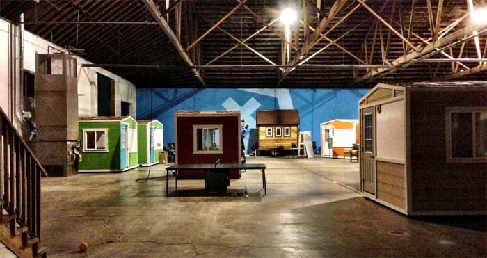
Part of The Speakeasy building is a place called Developer Town, which I had to take a pic of for you to believe. It is a big space where developers rent out little sheds inside to work in.
The Presentations
On top of setting up a great environment and personal feel, the re:build guys stacked up a diverse lineup of speakers and presentations. Topics covered the range of industry topics from working environments to design samples, UX and code implementations. Here are some tidbits and takeaways from each one.
You can check out their full bios, plus Twitter and website links on the re:build site.
I thought I should use a little hover love in them since Jenn’s talk was so much fun.
Zach Holman
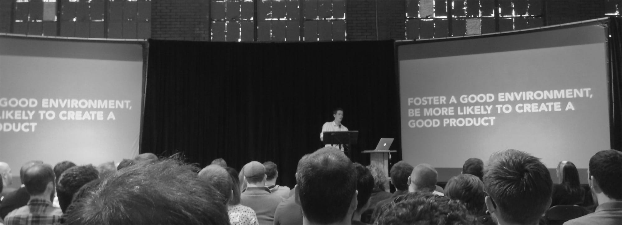
Zach hails from Github and he shared many of the things that go into putting together a great team of creatives. He gave examples of how to create a culture that you want and how to deal with the “internet dicks” that spring up as you release things. You can check out the slides and audio already on Speaker Deck. My favorite piece was that you want fixers on your team, so hire those that are “bothered by suck”.
David Kadavy
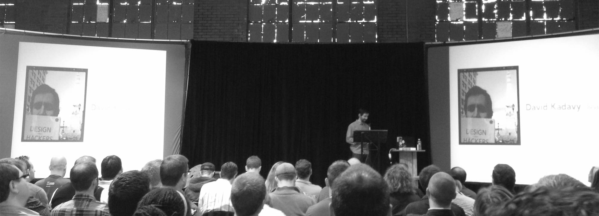
David is the author of Design for Developers and his talk focused on an intro to some UX principles, namely use cases and user personas. He used some good examples of the difference in experiences between Craigslist vs. Airbnb, typical weather app experiences vs. the Dark Cloud app and typical online clothiers vs. Gilt. He also gave a quick sample of applying some possible user personas to how the Twitter iPad app was designed. He had a relaxed, conversational style and is quite funny off the stage.
Jason VanLue
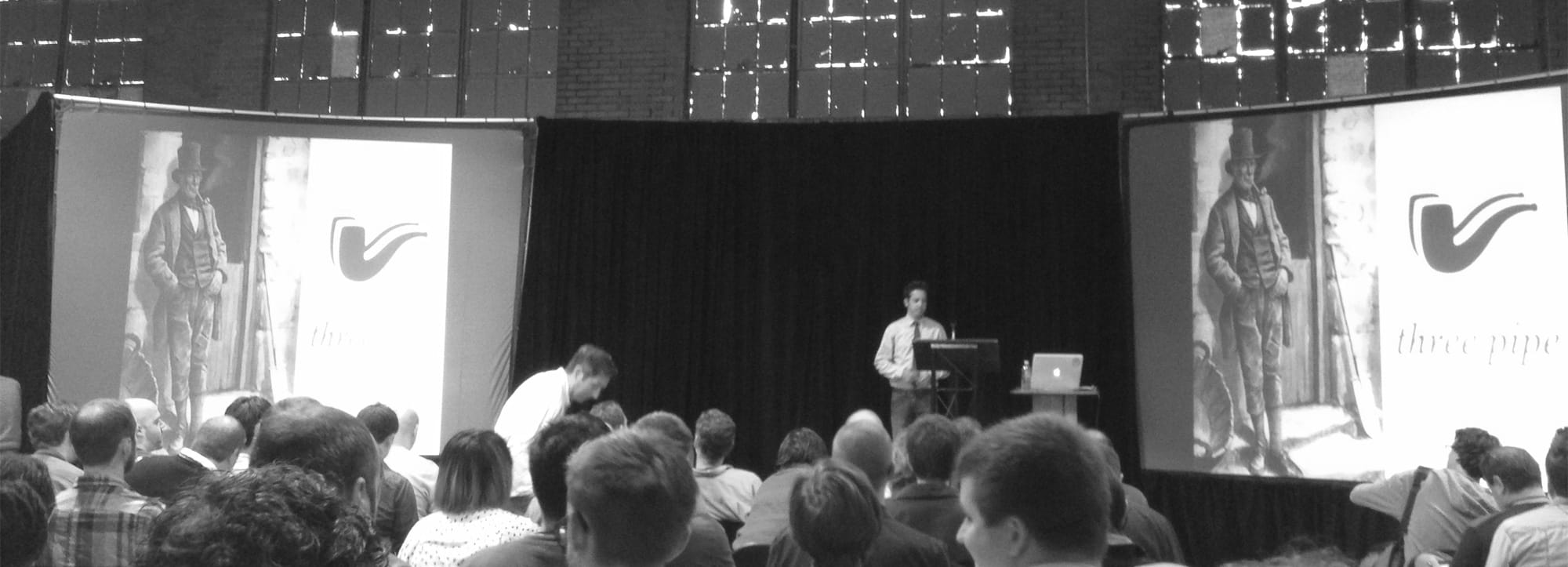
I hadn’t heard of this guy before so I was curious what he’d bring to the table. I kid, I kid. I work with Jason at Envy Labs, where he is the Hovering Director of Art. Jason is a great speaker and I really enjoy his take on design as a way to solve problems. There are lots of great takeaways throughout his talk, but the main theme is that screens could be as life changing as the automobile was for humankind. We should be focusing on problems that we want to solve for people and on designing for the other side of the screen. The history in his talk is fantastic and it is great to get so much inspiration from people outside of our industry.
Willo O’Brien
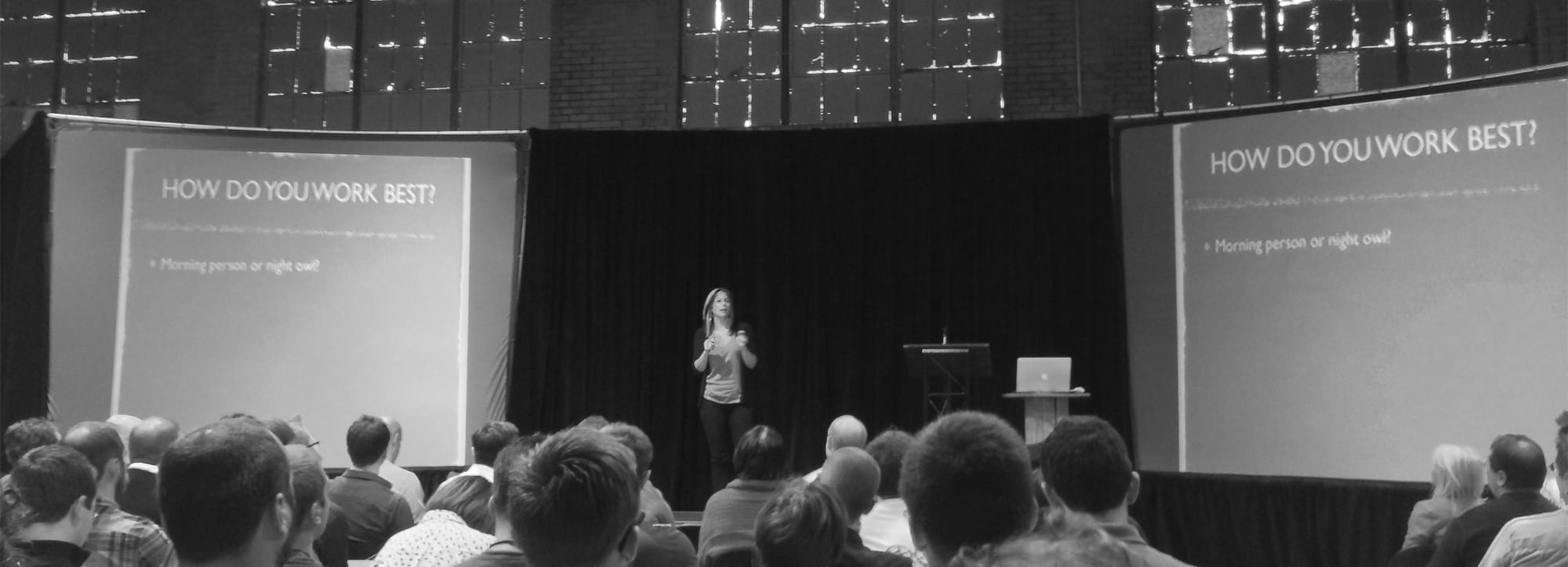
Willo has a great story of how she has gone from creating clothing to co-founding and consulting for startups for creatives. Her presentation was primarily about figuring out “how you work best”. She highly recommends making time for serendipity and to manage energy, not time. For her, this has been a matter of taking breaks that she calls art dates and establishing personal relationships with the people that she works with. A few resources that she recommends are: Book: Strengths Finder, Me Values Exercise and the Super Better App.
Patrick Filler
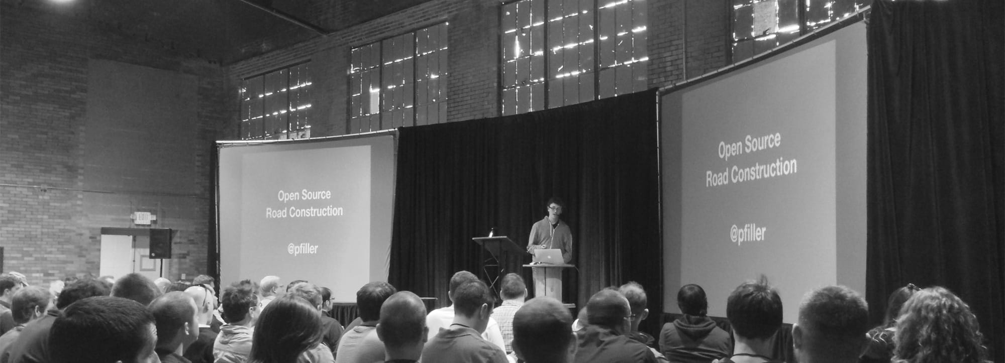
Patrick is a front-end dev at Harvest, where he was part of the development of the Chosen JavaScript Plugin. He shared how they had originally made it for Harvest in order to improve their forms and the decision to open source it. The best part of open sourcing projects is that anyone can do it. There are no connections necessary, it is a meritocracy. Put yourself out there and release some things that you’re working on or volunteer your skills to help out projects that you’re interested in!
David Sleight
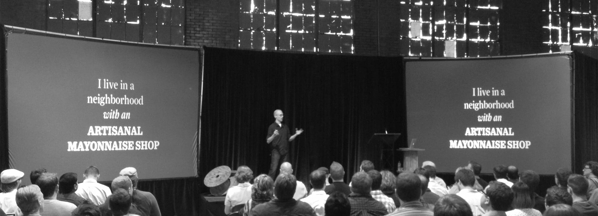
David is the product lead at Readability and he shared how publishing has been evolving via technology. Basically, there is a bigger demand for content in the world than in any time in history. The audience is huge, but diffuse. He shared that the keys items that differentiate good resources are APIs, content planning and flexible design. Also, he shared how natural language processing is impacting the future of content. Here are some recommended reads from his presentation: Orbital Content, Contents Magazine, Quartz, The Evening Edition, The Silent History, and The Atavist.
Jenn Lukas
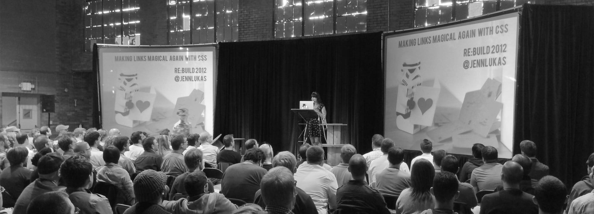
Jenn is a front-end dev at Happy Cog and I was especially looking forward to seeing her present. (I hope to see her speak at this cool event in Florida sometime.) She shared many ways to surprise and delight your users with hover-based interactions. She shared many great examples of hovers in action and then followed that up with how to use the dev tools to learn how they were achieved. Each example also came with code samples so her slides will be really helpful. One quote that I can’t leave out is “Color fade is the smooth jazz of hovers”. She shared a cool way of animating height by using max-height: 0 and encouraged everyone to check out backface-visibility. Her excitement for these things was infectious and there were lots of cats!
Mark Otto
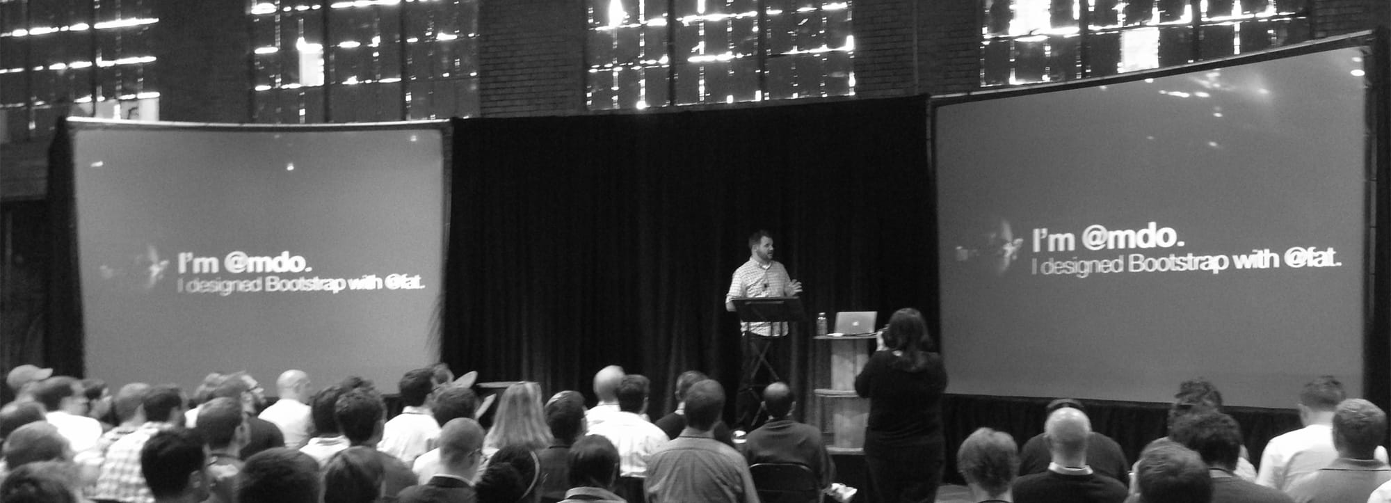
Mark is one of the creators of Bootstrap and has recently left Twitter and joined Github. He shared how important it is to design how stuff works and the 5 principles behind creating Bootstrap. They were: treat the docs like they’re the product, say no all the time, educate by enforcing coding styles, help folks avoid writing JavaScript and reach every person on the planet. Everything is a design system and theirs consisted of base classes, prefix modifiers, formatting, property order and compiling. Going forward, his main goal is to help awesome poeple do awesome stuff.
Dave Shea
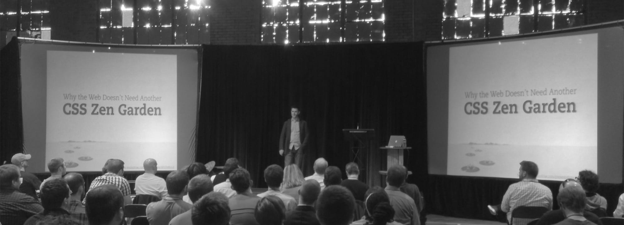
Dave is O.G. when it comes to the design and dev community. He wrapped up the conference with a walk through how we got to where we are today. Part of this is his work with CSS Zen Garden, which really helped push CSS layout. One of the more interesting things was about how the original purpose behind the web was to create structure for CERN information. Early users of the web showed pretty quickly that we were more interested in visuals than order. CSS Zen Garden was created to help display what could be done visually with CSS. It had an agenda, a place and a time.
I had a really great time and it was awesome to also get to meet some people that use Code School. I really love to learn about the people that use it and what types of positions that they have. Thank you specifically to David Poindexter and Sam Kligerman for sharing their stories.